

Having all mission critical data about your company visible in real time is an important tool to drive your team towards success. Besides using Mindlog Dashboard Widgets, we also have a large wall-mounted monitor which displays all critical data and charts, such as support tickets, response times, revenue etc.
A lot of companies spend a fortune on business analytics tools and dashboard software. In this article of our "Hack your business" series we are are going to show you how you can create a beautiful, custom-tailored dashboard for free!
Are you ready to get started? Let's go!
Step 1: Deciding which data is important for you
The key performance indicators you select tell a lot about your business. This is why it's so important to choose wisely and only select the data that is relevant to drive your business forward. Let me stress this point: More data and a lot of fancy charts will proof counter-productive, display only as much data as you need to. The goal of a dashboard is not to offer in-depth analytics of the past, it is a tactical tool that should provide context to your team and give them immediate feedback on their performance. Ideally, a dashboard should help you to create a feedback loop that will trigger the right actions to reach your goals.
In our example we are taking a look at service team of a large IT vendor. We did some interviews with their service staff and asked them what they consider important for their work.
Step 2: Select your charts
So, once you have decided on the basic parameters you want to measure, let's decide what charts you want to display on your dashboard. There are tons of really good charting libraries out there. At ZeyOS, we usually stick to D3.js and Chartist. Simple check the example sessions and see what charts make sense for you.
For our service team, we have decided on the following metrics:
- Revenue per month
- The number of tickets, assorted by age
- What's the averate effort per ticket?
- How many hours are booked per day?
- How many hours are booked per agend (on average) per day?
This metrics should give us an overview how our service team is doing. We were able to find a suitable chart of each metric on the Chartist Example Page, but keep in mind you could use any charting library that does the job.
For this tutorial, I will walk you through the first chart in detail - the procedure is basically the same for all subsequent charts and you can easily check the source code for each of the charts on our GitHub repostiory.
Step 3: Prepare the charts
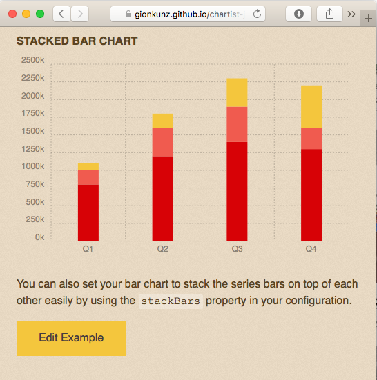
So the next step is to transfer the chart's source code to ZeyOS and to find out the data structure that ZeyOS will have to provide to "feed" the charting component with data. Let's assume we want to create a bar chart to display the revenue per month. For this purpose, let's check the code example on the Chartist Example Page to see what sort of data will be required:
new Chartist.Bar('.ct-chart', {
  labels: ['Q1', 'Q2', 'Q3', 'Q4'],
  series: [
    [800000, 1200000, 1400000, 1300000],
    [200000, 400000, 500000, 300000],
    [100000, 200000, 400000, 600000]
  ]
}, {
  stackBars: true,
  axisY: {
    labelInterpolationFnc: function(value) {
      return (value / 1000) + 'k';
    }
  }
}).on('draw', function(data) {
  if(data.type === 'bar') {
    data.element.attr({
      style: 'stroke-width: 30px'
    });
  }
});
As you can see, the Chartist.Bar component requires an array of labels for the x axis as well as a 2-dimensional array for the data. Let's compile all this into an HTML template:
<!DOCTYPE html>
<html>
  <head>
    <link rel="stylesheet" href="//cdn.jsdelivr.net/chartist.js/latest/chartist.min.css">
    <script src="//cdn.jsdelivr.net/chartist.js/latest/chartist.min.js"></script>
    <style type="text/css">
        html, body, #chart { height: 100%; }
    </style>
  </head>
  <body>
    <div id="chart"></div>
    <script type="text/javascript">
      new Chartist.Bar('#chart', {
        labels: $labels,
        series: $series
      }, {
        stackBars: true,
        axisY: {
          labelInterpolationFnc: function(value) {
            return (value / 1000) + 'k';
          }
        }
      }).on('draw', function(data) {
        if(data.type === 'bar') {
          data.element.attr({
            style: 'stroke-width: 30px'
          });
        }
      });
    </script>
  </body>
</html>
As you can see, we place the chart data into an HTML body and load the Chartist library through the jsdelivr.com CDN (Content Delivery Network). You can also see that we replaced the values for "labels" and "series" with placeholders that we will use for our own data.
Next, head over to ZeyOS and open "Enhancements" in your menu. Go the the "Resources" tab and add a new resource:
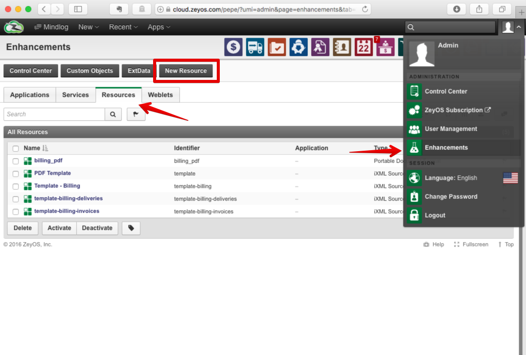
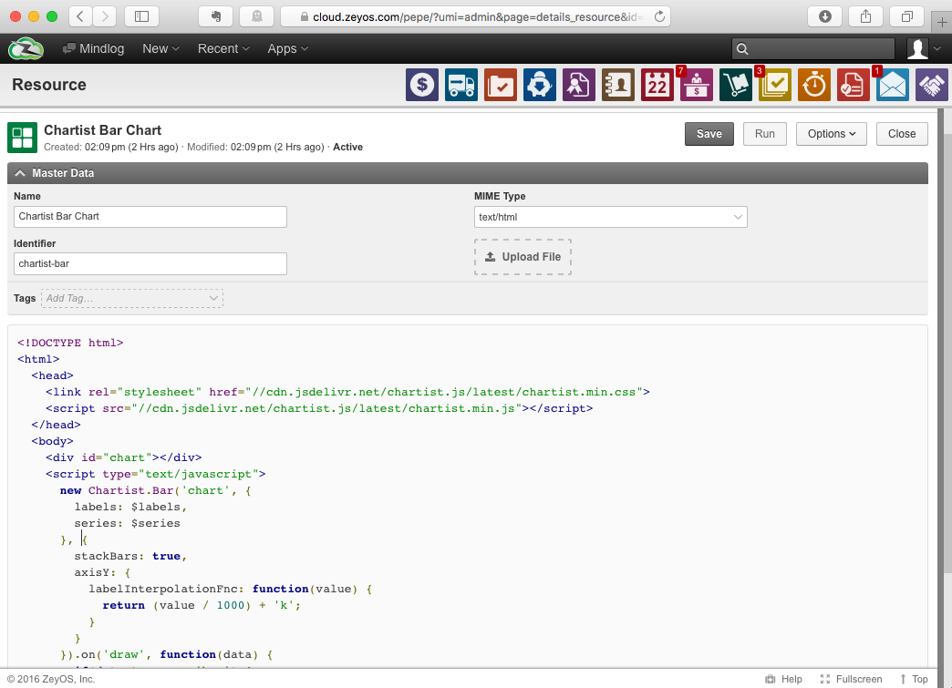
Next, copy/past the code from above in the code editor and select mime type "text/html" (alternatively you can also upload the HTML file). For the ID we will call the resource chartist-bar, so we can include it later.
Now is where it get's interesting. In the Enhancements view, open the "Weblet" tab and add a new weblet.
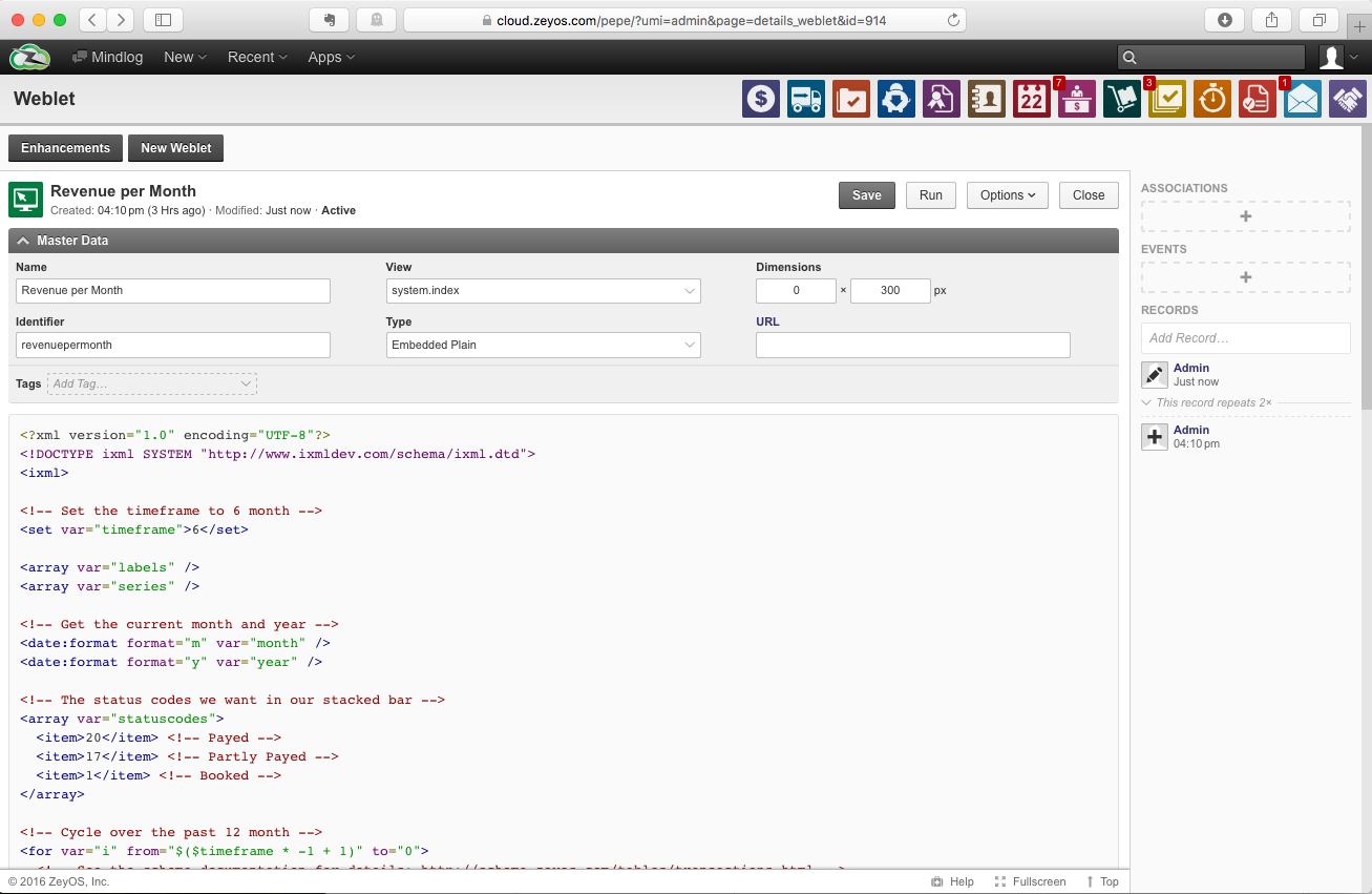
Weblets are extensions that you can place virtually anywhere in ZeyOS. First, you select where you want to place your weblet in the "View" field. If you want to display your dashboard as part of your mindlog stream, select the view system.index.
As for the weblet type, select Embedded Plain. You can also specify the height of your chart, e.g. 300px.
Next we are going to create an iXML script that will select the data from the database and pass the data on to our template. If you want to find out more about the ZeyOS database schema, check out the ZeyOS Schema Documentation.
<?xml version="1.0" encoding="UTF-8"?>
<!DOCTYPE ixml SYSTEM "http://www.ixmldev.com/schema/ixml.dtd">
<ixml>
<!-- Set the timeframe to 6 month -->
<set var="timeframe">6</set>
<array var="labels" />
<array var="series" />
<!-- Get the current month and year -->
<date:format format="m" var="month" />
<date:format format="y" var="year" />
<!-- The status codes we want in our stacked bar -->
<array var="statuscodes">
<item>20</item> <!-- Payed -->
<item>17</item> <!-- Partly Payed -->
<item>1</item> <!-- Booked -->
</array>
<!-- Cycle over the past 6 month -->
<for var="i" from="$($timeframe * -1 + 1)" to="0">
<!-- See the schema documentation for details: http://schema.zeyos.com/tables/transactions.html -->
<db:select var_result="invoices" type="assoc">
<db:fields>
<db:field>status</db:field>
<db:expression alias="revenue">SUM(netamount)</db:expression>
</db:fields>
<db:table>transactions</db:table>
<db:is field="type">3</db:is> <!-- Only invoices -->
<db:in field="status" var="statuscodes" />
<db:is field="date" func=">=">
<date:create day="1" month="$($month + $i)" year="$year" var="start" />
</db:is>
<db:is field="date" func="<">
<date:create day="1" month="$($month + $i + 1)" year="$year" />
</db:is>
<db:groupby>
<db:groupfield>status</db:groupfield>
</db:groupby>
</db:select>
<!-- Create the label from the start date -->
<date:format format="m/Y" var="labels[]">$start</date:format>
<!-- Initialize the values -->
<array var="values" />
<foreach var="statuscodes" var_key="key" var_value="status">
<set var="value">0</set>
<foreach var="invoices" var_value="invoice">
<if value1="$invoice.status" value2="$status">
<set var="value">$invoice.revenue</set>
<break />
</if>
</foreach>
<cast var="value" type="float" />
<assign var="series[$key][]" var_source="value" />
</foreach>
</for>
<output>
<include id="chartist-bar">
<param name="labels">
<encode:json var="labels" />
</param>
<param name="series">
<encode:json var="series" />
</param>
</include>
</output>
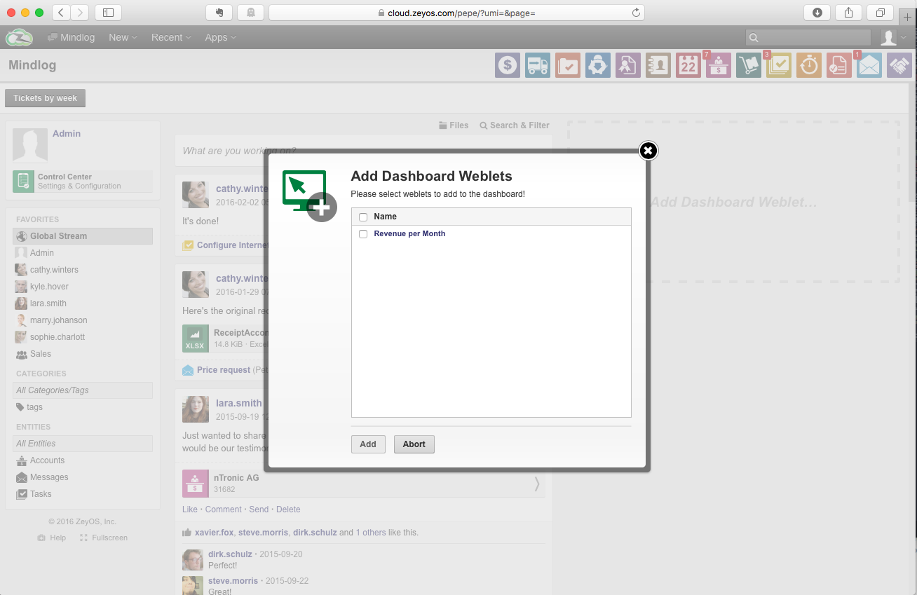
</ixml>After adding the weblet, head over to your mindlog dashboard add click the area with the plus sign on the right to add a new dashboard:
And voi la, you can see the finished result:
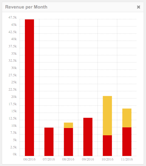
As you can see, it's pretty easy to visualize data with ZeyOS. All you need to do, is query and shape the data using either Zymba or iXML and you are good to go.
